


Etsy listing photos convert when the first image survives the thumbnail crop and the next nine answer a buyer’s questions before they think to ask. You win the click with a clean, centered hero shot, then prove size, context, and variations across your remaining slots so a curious browser turns into a confident buyer.
Most sellers shoot one decent photo, upload it, and move on. The shops that outsell them treat their Etsy listing photos as a set where each slot has a job: one image earns the click, the rest close the sale. Below is how to build that sequence, the specs that protect your quality, and how to keep improving the photos that actually move the needle.
Why your thumbnail wins or loses the click

Your first photo becomes the thumbnail shoppers see in search, and it does almost all of the work of getting a click. Etsy auto-crops that first image to a roughly 5:4 frame (around 570 x 456 pixels in the grid), so anything pushed to the edges can get trimmed. Keep your product inside the middle 70 percent of the frame and you survive every crop, on desktop and mobile.
A horizontal or square first photo crops more predictably than a tall vertical one. Etsy’s own guidance is to give the main image extra attention because it is the photo that draws shoppers in. A bright, uncluttered background and a product that fills most of the frame reads clearly even at thumbnail size, where most of your competition is fighting for the same glance.
💡 Seller Tip
Before you publish, shrink your hero image on screen until it is the size of a postage stamp. If you cannot instantly tell what the product is and what makes it special at that size, the thumbnail is too busy. A common move among top sellers is testing the first photo at thumbnail scale next to three competitor listings to see which one the eye lands on first.
The ideal sequence across your 10 photo slots
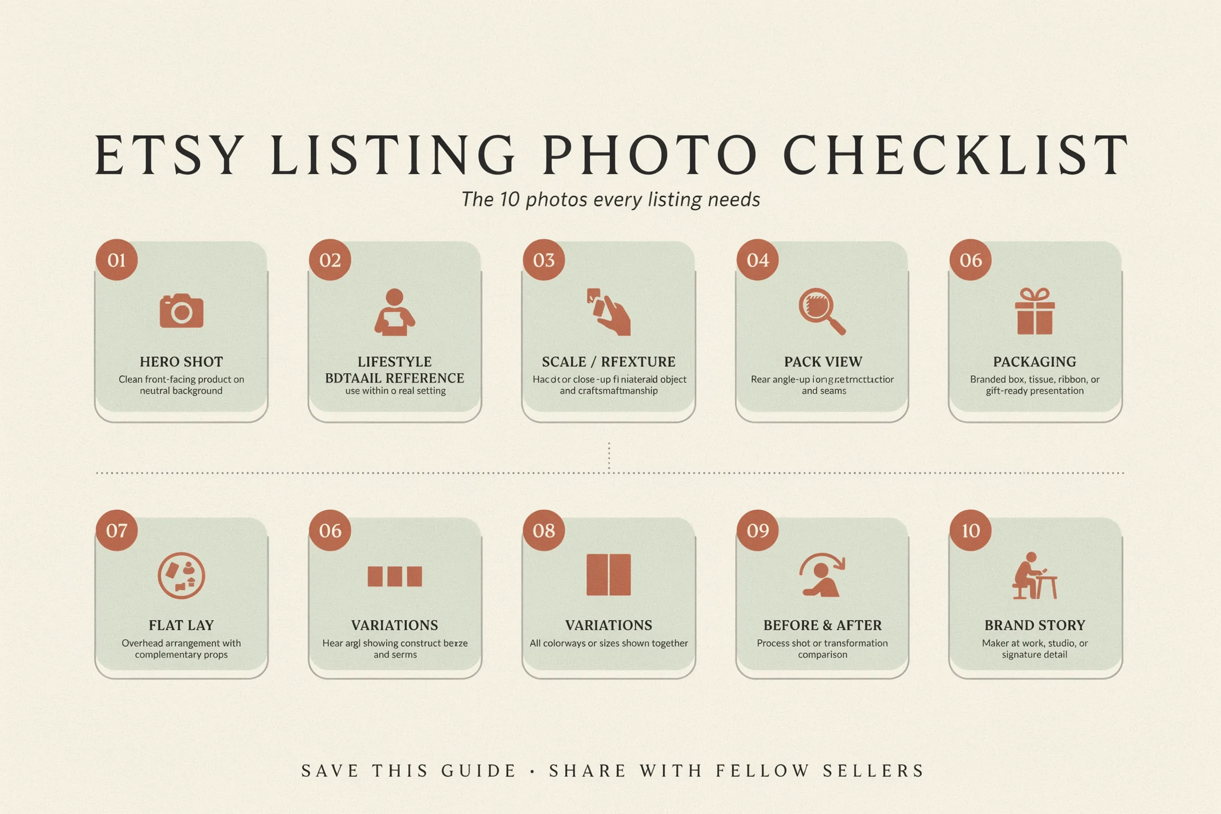
Etsy lets you add up to 10 photos (and on many listings now even more), plus one short video of 5 to 15 seconds. Filling every slot is not busywork. Each frame removes one more reason to hesitate. Here is a sequence that answers buyer questions in the order they tend to come up.
Slot-by-slot photo plan
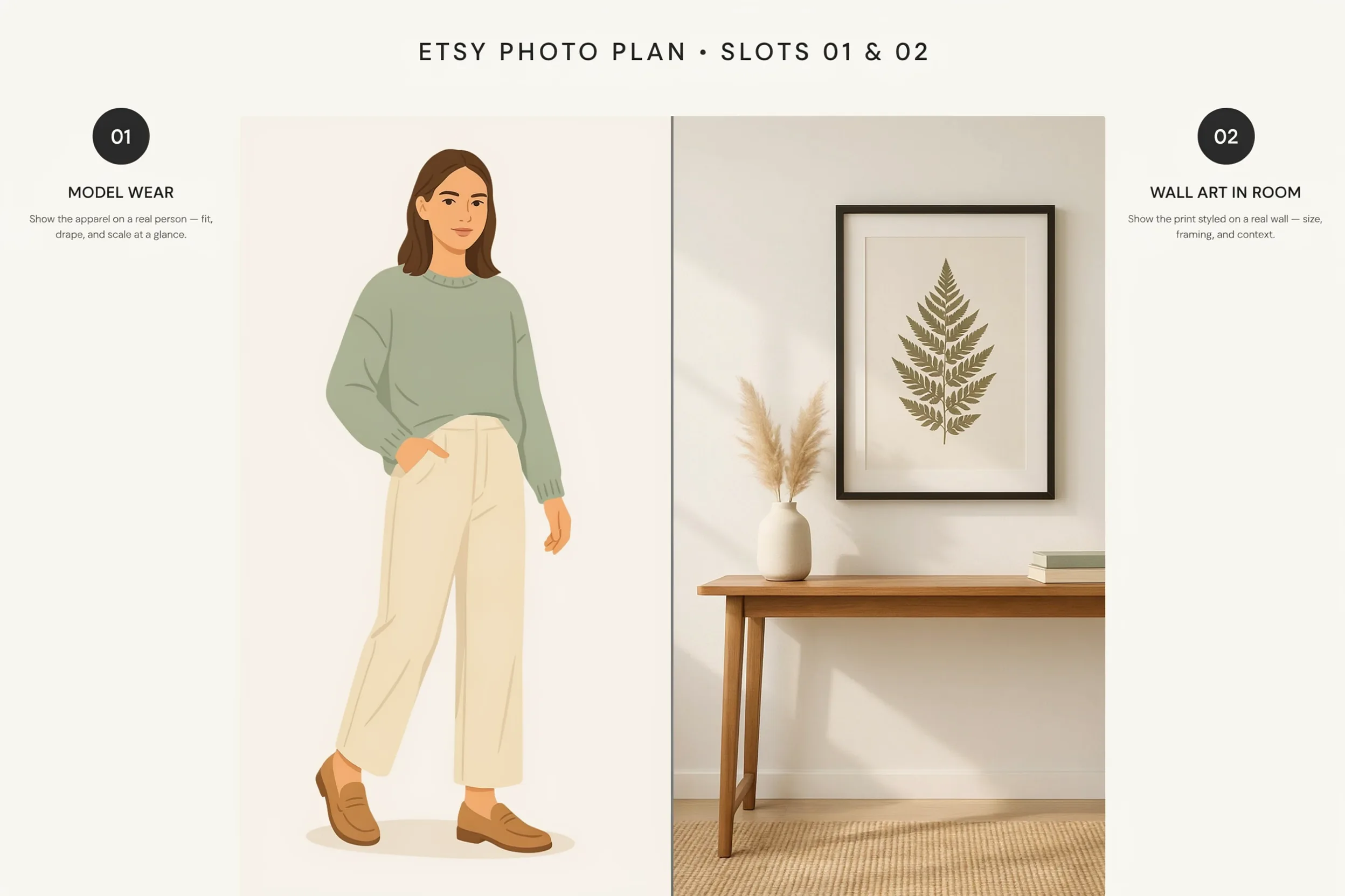
Use this as a template and adapt it to your category. Apparel needs a model shot early, while wall art needs a room scene early.
| Slot | Photo type | Question it answers |
|---|---|---|
| 1 | Hero shot | What is this and is it worth a click? |
| 2 | Lifestyle / in use | Can I picture this in my life? |
| 3 | Scale reference | How big is it really? |
| 4 | Detail / close-up | Is the quality good? |
| 5 | Variations | What are my options? |
| 6 | Alternate angle | What does the back or side look like? |
| 7 | Infographic / specs | Dimensions, materials, what is included? |
| 8 | Group / bundle | How does it pair with other items? |
| 9 | Packaging | Will it arrive nicely, is it gift-ready? |
| 10 | Process / behind the scenes | Who made this and can I trust them? |
You do not need a separate photoshoot for each one. A single styled scene can give you a hero, a detail crop, and a scale shot if you frame it well. Etsy’s seller handbook recommends mixing photo types precisely because each style tells the buyer something different, and together they build a full picture of the product.
📌 Did You Know?
Research from the Baymard Institute found that exploring the images is the first action a majority of shoppers take on a product page, ahead of reading the title or description. Your photos are doing the convincing before a single word of your listing gets read.
Show scale, context, and variations to build instant trust
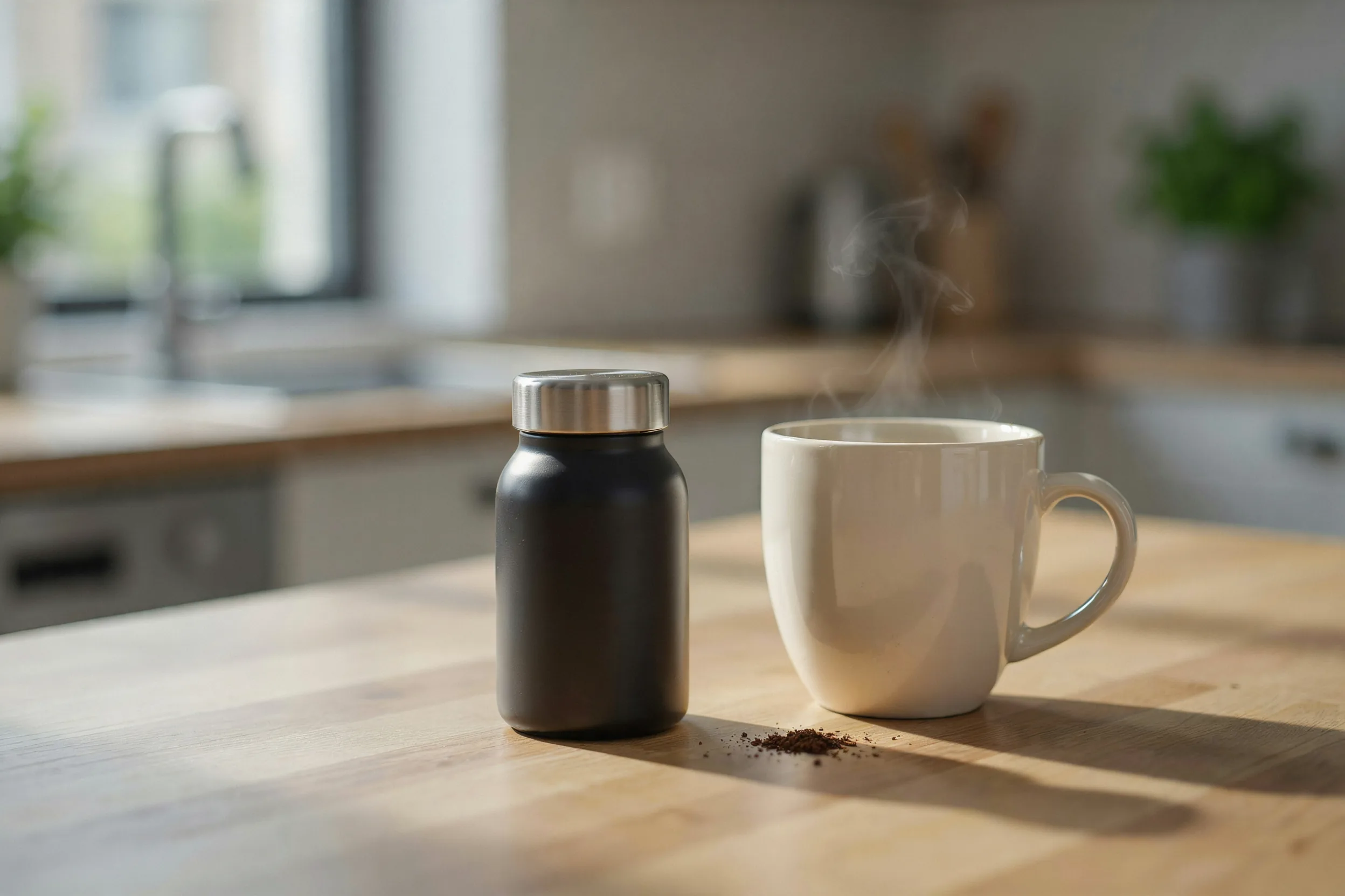
Three photo types do the heaviest lifting once you have the click. Skip them and buyers fill the gap with doubt, which usually means they leave.
Prove the size with a scale shot
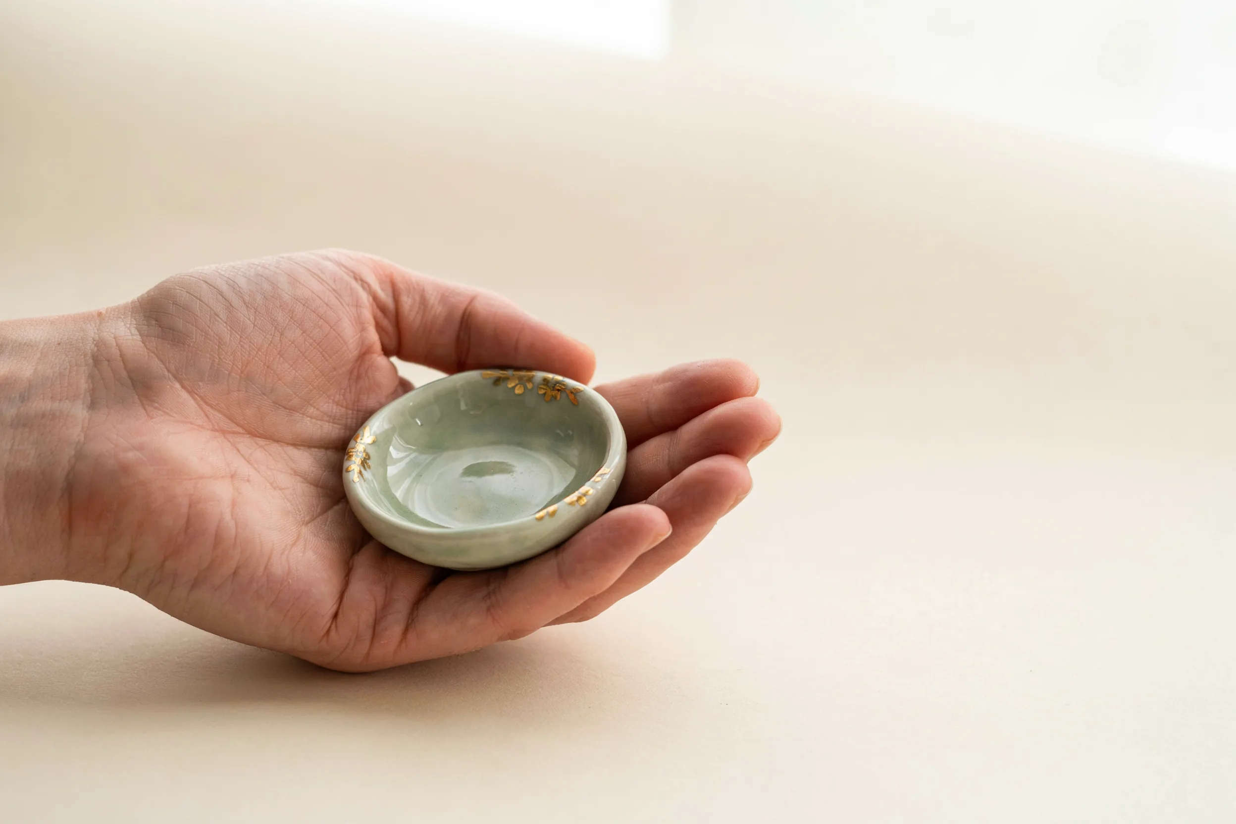
Size confusion is one of the top reasons items get returned or left in a cart. Put the product next to something familiar: a hand holding it, a coin, a coffee mug, or the item placed on a desk or wall. Baymard’s benchmarks found that a large share of online stores still fail to give shoppers a clear in-scale image, so getting this right is a quiet advantage on Etsy too.
Add context with a lifestyle shot

A lifestyle photo shows the product doing its job: a candle lit on a nightstand, a print framed above a real sofa, a tote carried on a shoulder. It lets the buyer imagine owning it. White-background shots prove what the item is, but context shots are what make someone want it.
Show every variation
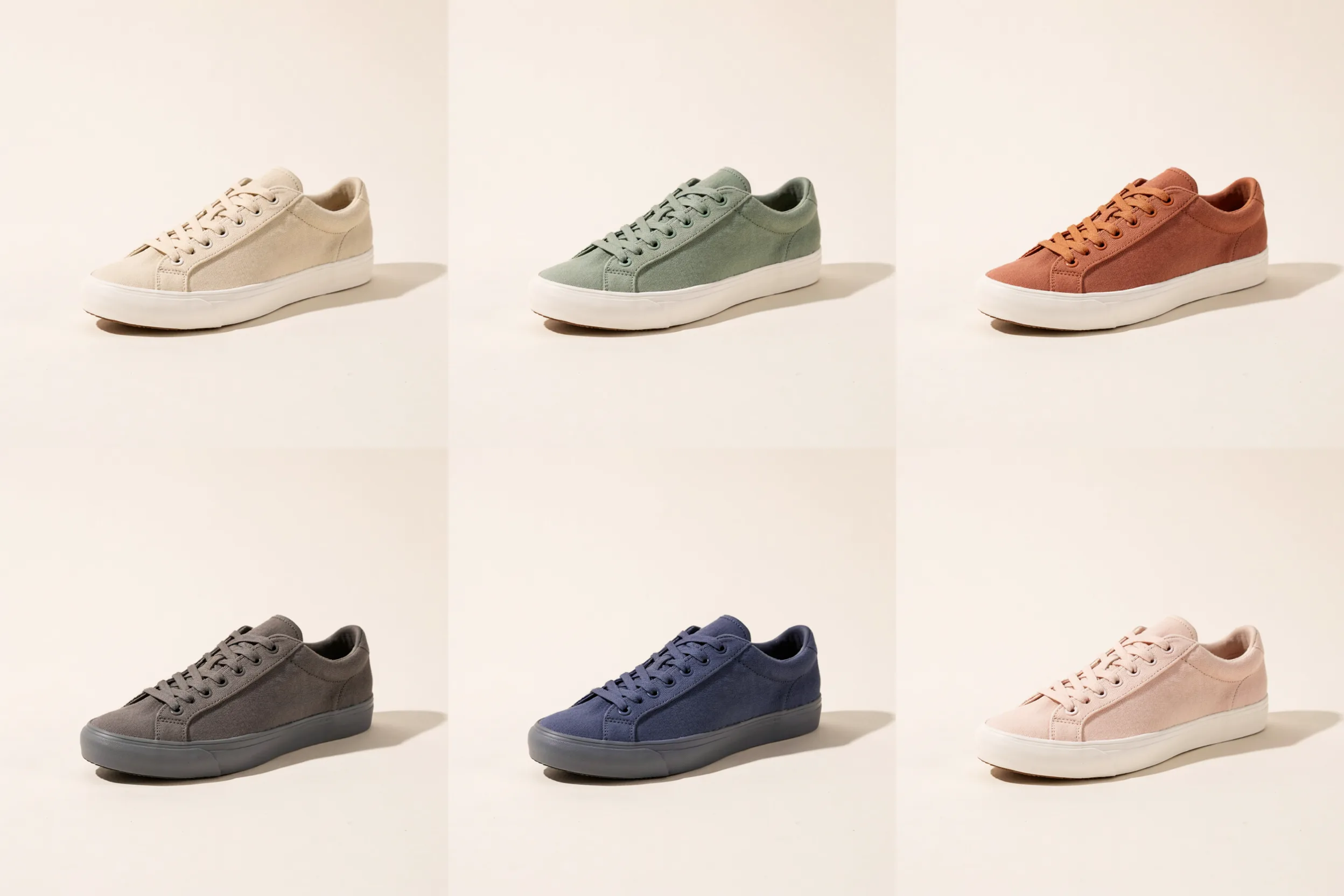
If you sell three colors or five sizes, show them. A buyer who cannot see the exact shade they want often assumes you do not offer it. A clean grid of all variations in one slot also reduces the questions that land in your inbox.
⚠️ Common Mistake to Avoid
Uploading ten near-identical studio shots from slightly different angles. It feels thorough, but it answers the same question ten times and leaves scale, context, and variations unanswered. Audit your slots by question, not by quantity: if two photos answer the same thing, replace one with a scale or lifestyle shot.
Lifestyle vs white-background: which converts better?
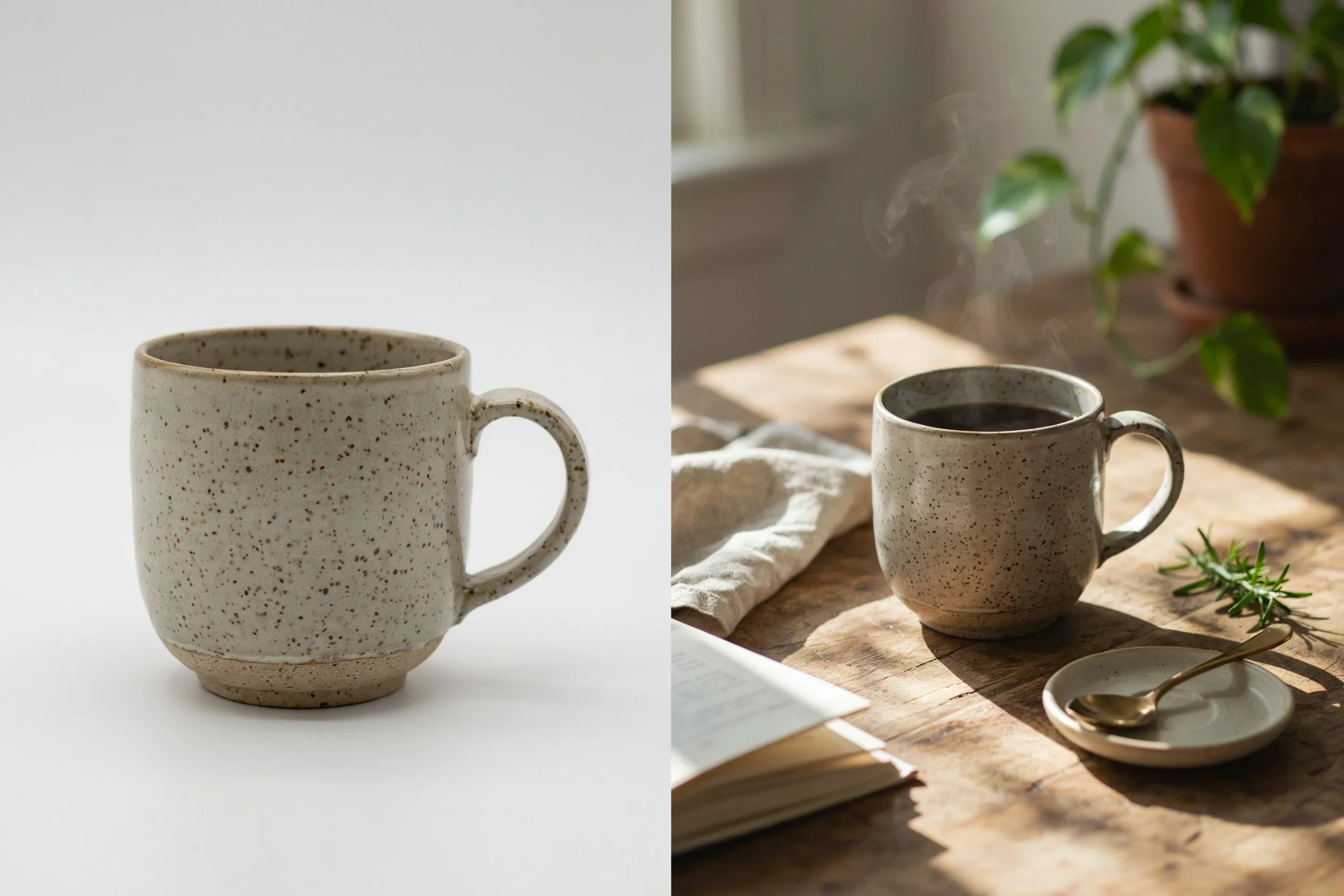
Neither one wins alone, and you do not have to choose. The pattern that converts is a clean hero (often white or neutral background) so the thumbnail reads clearly in search, followed quickly by lifestyle shots that create desire. The hero gets the click, the lifestyle frames close the sale. If you only have time for two photos, make one of each.
For physical products, a crisp white-background image keeps your thumbnail competitive in the search grid. For digital products and printables, a styled mockup that shows the file in a real setting (framed on a wall, opened on a laptop) usually beats a flat preview, because buyers struggle to value something they cannot hold.
Infographics and text overlays that do the selling
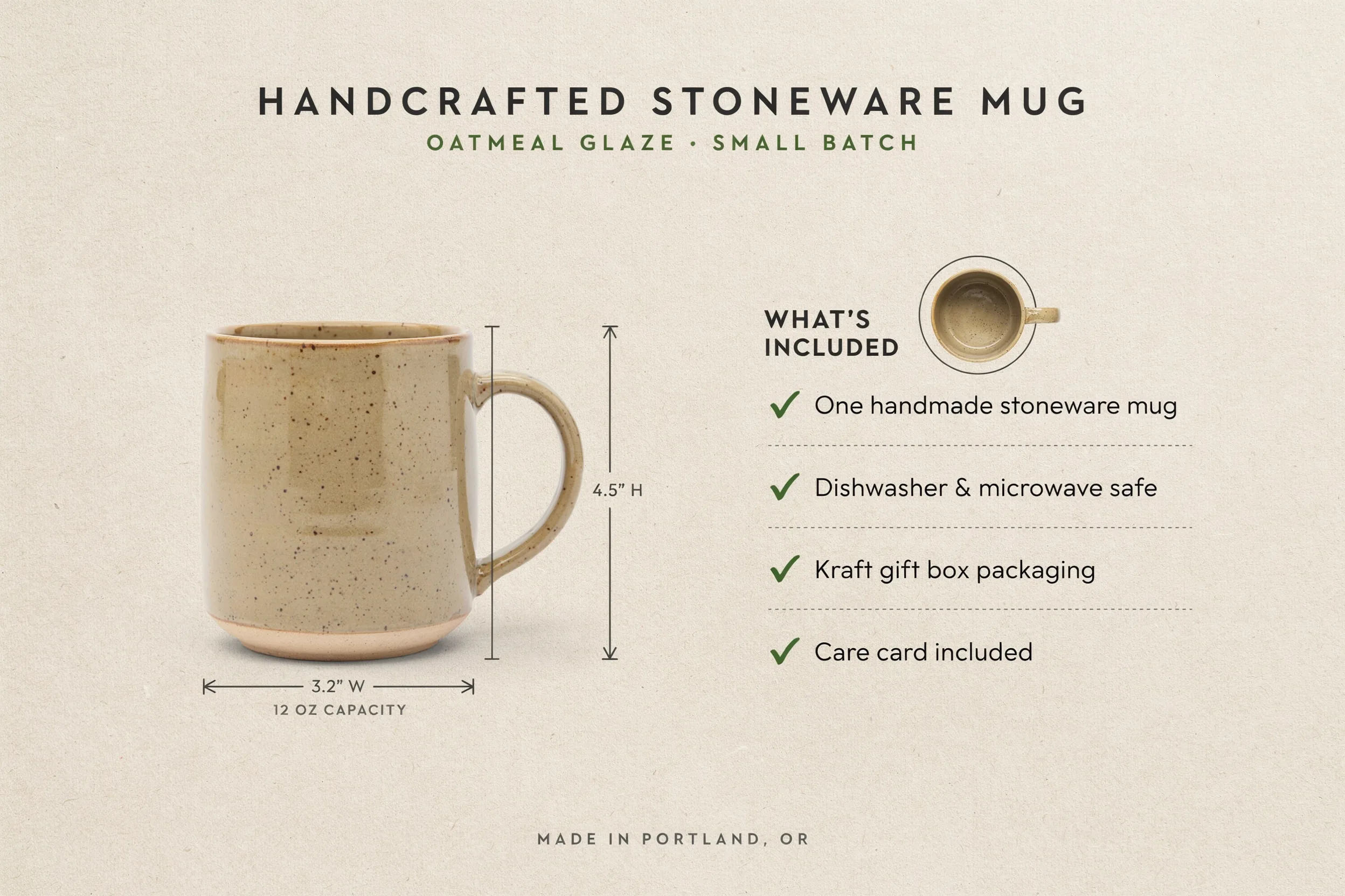
One or two photos with light text can answer questions a buyer would otherwise have to dig for. Good uses include a dimensions diagram, a “what’s included” checklist, a materials or care callout, or a personalization example. Keep text short, high-contrast, and large enough to read on a phone.
Do not overlay text on your first photo. The thumbnail should sell the product visually, and heavy text there can look like an ad and get skipped. Save overlays for the middle slots where shoppers are already comparing details.
💡 Seller Tip
Use the video slot as an eleventh photo. A slow 360 turn or a 6-second clip of the item being used, opened, or worn answers the texture and movement questions a still photo cannot. It autoplays in search on many devices, which gives your listing extra motion right where shoppers are scanning.
Etsy image specs that protect your quality

Great composition still falls flat if the file is soft or slow to load. Etsy’s published image requirements give you room to shoot high quality without hitting limits, and the Etsy photography guide covers the shooting fundamentals.
- Resolution: at least 2000 pixels on the shortest side. Etsy recommends going higher, around 3000 pixels, so the zoom view stays sharp.
- Aspect ratio: square (1:1) or landscape (4:3) work best; 2000 x 2000 or 2700 x 2025 are safe defaults.
- Format: JPG, PNG, or non-animated GIF. JPG is the right pick for most product photos.
- File size: the hard limit is 10 MB, but keeping each file under about 1 MB (JPG quality near 80 to 85 percent) loads faster without visible quality loss.
Sharp, fast-loading images matter beyond aesthetics. The same photos that win shoppers also feed your discoverability, so it is worth pairing this work with a solid Etsy SEO foundation and a broader Etsy marketing plan so the traffic your photos convert keeps arriving. For the lighting and shooting fundamentals behind these shots, see our Etsy product photography guide.
How to A/B improve the photos that matter
Treat your Etsy listing photos as something you refine, not a one-time task. Etsy does not have a built-in split test, so you test in sequence: change one variable, give it a couple of weeks of similar traffic, and compare.
The highest-leverage test is almost always the first photo, because it controls your click-through rate from search. Swap a busy hero for a cleaner one, or a flat shot for a lifestyle angle, and watch whether visits rise. Once clicks improve, test the order of your middle slots to lift conversion. Keep a simple note of what you changed and when so you can tell what worked.
The smartest tests start with demand, not guesswork. Knowing which products and styles are actually selling in your category tells you what kind of hero shot and which variations buyers are reaching for right now, so you shoot for proven demand instead of hoping. If you are still setting up your shop, our guide on how to sell on Etsy covers the listing basics that sit underneath all of this.
See what’s selling on Etsy right now
The best photo brief starts with knowing what shoppers are actually buying in your niche this week. Podkon tracks live Etsy best-sellers and trends across every category, so you can spot demand before you shoot and build your hero shot around products people are already reaching for. See it in action on the features page.
Your Next Step: Open your best-selling listing, shrink the first photo to thumbnail size, and ask whether it earns the click. If not, reshoot that one image first, since it controls more of your sales than any other photo in the set.