


Etsy product photography is the practice of shooting and editing listing images that earn the click and close the sale. You do not need a studio or a pro camera. A window, a clean background, a phone, and a plan for your first 10 photo slots will lift both your click-through rate in search and your conversion on the listing page.
Shoppers decide in a fraction of a second whether to tap your listing, and that decision rides almost entirely on your first photo. Once they land on the page, the rest of your images either answer their questions or send them back to results. Get the photos right and you raise the two signals Etsy rewards most, clicks and purchases. Here is a working setup and a slot-by-slot plan you can run today.
Why Etsy product photography decides your click rate

Search shows shoppers a grid of thumbnails. Your title and tags get you into that grid, but your photo wins the tap. A listing that shows often and rarely gets clicked sends Etsy a weak engagement signal, and weak engagement costs you placement over time. So your hero image is not decoration, it is the lever that controls how much of your hard-won search visibility turns into traffic.
The same logic carries onto the listing page. A buyer who cannot judge size, texture, or how an item looks in real life hesitates, and a hesitating buyer leaves. Strong photos remove that doubt fast, which is why image quality feeds straight into conversion. If you want the full ranking picture behind this, our Etsy SEO guide breaks down how quality and engagement sit alongside relevance.
📌 Did You Know?
Etsy lets you add up to 20 photos per listing and recommends listing photos be at least 2000 pixels in both width and height. Your first photo should be at least 635 pixels on each side, or it can show up lower in search, according to the Etsy image requirements.
Build a home studio setup that costs almost nothing
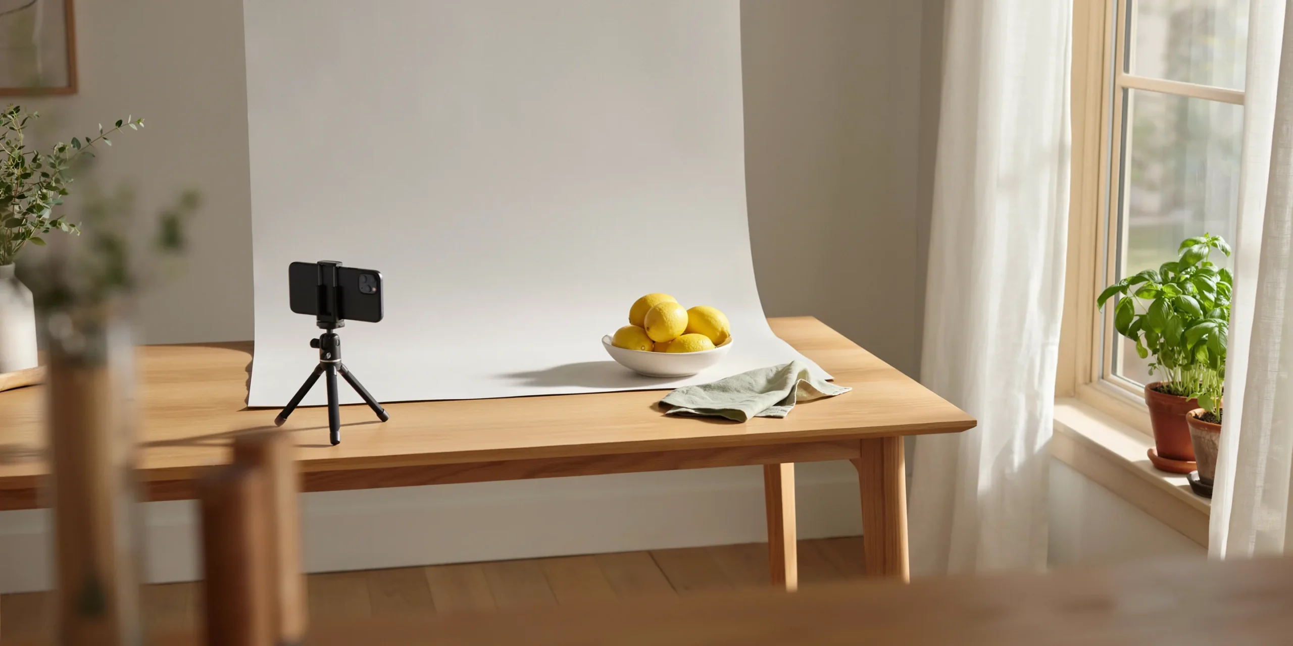
You can shoot listing-grade photos on a kitchen table. The whole kit is a window, a clean surface, a sheet of poster board, and your phone. What separates a flat photo from one that sells is not gear, it is light and consistency. Set up once, keep the same spot, and your shop starts to look like a brand instead of a folder of random snapshots.
Use natural light, not your overhead bulbs

Soft, indirect daylight is the most flattering and forgiving light you can get for free. Shoot next to a large window during the day, with the light coming from the side rather than behind you. Skip the ceiling lights and the camera flash, since both throw harsh shadows and shift your colors. If the sun is blasting straight in, tape a sheet of plain paper or a thin white curtain over the window to diffuse it into an even glow.
For shadows that look too heavy on the dark side of your product, prop a sheet of white poster board opposite the window. It bounces light back and fills the shadow without any extra equipment. The Etsy Seller Handbook covers this same lighting approach in its Ultimate Guide to Product Photography, and it is the single highest-impact change most new sellers can make.
💡 Seller Tip
A common move among top sellers is to shoot a full batch in one session on the same overcast morning. Cloudy days act like a giant softbox, giving you even light with no harsh shadows. Photograph every product and variation at once, and your whole shop gains a consistent look that reads as professional.
Pick clean, simple backgrounds

Your background should make the product stand out, not compete with it. A plain white or light neutral surface works for almost any item and keeps the focus where it belongs. Poster board, a painted wood board, a marble contact-paper sheet, or a length of linen all do the job for a few dollars. Keep one or two backgrounds and reuse them so your listings feel like a set.
Fill the frame so the product takes up roughly 60 to 80 percent of the shot, centered, with a little breathing room around the edges. That margin matters because Etsy crops your image into square, portrait, and landscape thumbnails in different places, and a product jammed to the edge can get sliced off.
Your phone camera is enough

A modern phone camera shoots more than enough resolution for Etsy. Wipe the lens, turn on the gridlines, and tap the screen to lock focus and exposure on your product. Avoid the digital zoom, which softens detail, and instead move the phone closer. Steady the shot by bracing your elbows on the table or using a cheap tripod, since even slight shake shows up as blur at full zoom on a buyer’s screen.
The first 10 of 20 listing photo slots and what each should show
Filling at least 10 of the 20 photo slots Etsy allows is one of the easiest wins on Etsy, because every extra image answers a question text cannot. Each photo should earn its place by showing something new, not repeating the last angle. The table below maps a reliable slot order you can adapt to almost any product.
A slot-by-slot photo plan
| Slot | Photo type | What it shows |
|---|---|---|
| 1 | Hero | The product clean and centered, the image that wins the click |
| 2 | In use | The item worn, held, or styled in a real setting |
| 3 | Scale | Size next to a hand, coin, or common object |
| 4 | Detail | Close-up of texture, stitching, or material quality |
| 5 | Angles | Side and back views so nothing stays hidden |
| 6 | Variations | Color, size, or style options in one frame |
| 7 | Personalization | A sample of custom text, names, or monograms |
| 8 | Packaging | Gift wrap or how the order arrives |
| 9 | Specs graphic | Dimensions, materials, or care text on the image |
| 10 | Trust or process | A review quote, your studio, or how it is made |
Lead with the hero, follow with an in-use shot, and put scale and detail early since those answer the questions that stall a purchase. The Etsy Seller Handbook lays out a similar mix in its rundown of the essential types of product photos, and its product photography checklist is worth keeping open while you shoot.
Edit for accuracy, not for filters
Editing should make the photo look like the real product on a good day, nothing more. Straighten the shot, crop for a tight composition, and nudge brightness and contrast so the item reads clearly. Correct the white balance so whites look white instead of yellow or blue, which is where most home photos drift. Resist heavy filters that punch up colors, because a buyer who receives something duller than the photo leaves a poor review and may open a case.
Color accuracy is a real returns issue, so export your images in the sRGB color profile, which is what Etsy displays. If your edited colors look right on your screen but off on the site, an incorrect color profile is the usual cause. Keep files in a supported format such as JPG or PNG, and aim for sharp, well-lit images at full resolution rather than tiny compressed ones.
⚠️ Common Mistake to Avoid
Many sellers over-saturate photos to make products pop, then field returns when the real color disappoints. Edit toward truth, not toward drama. A buyer who gets exactly what the photo promised leaves the five-star review that lifts your shop’s customer experience score and your rank.
Optimize the thumbnail, the photo that wins the click
Your first photo becomes the thumbnail in search, and it is doing the heaviest lifting in your whole shop. Most shoppers browse on a phone, where that thumbnail is small, so it has to read instantly at a glance. Test it by shrinking it on your screen until it is the size of a fingernail. If you cannot tell what the product is, neither can a scrolling buyer.
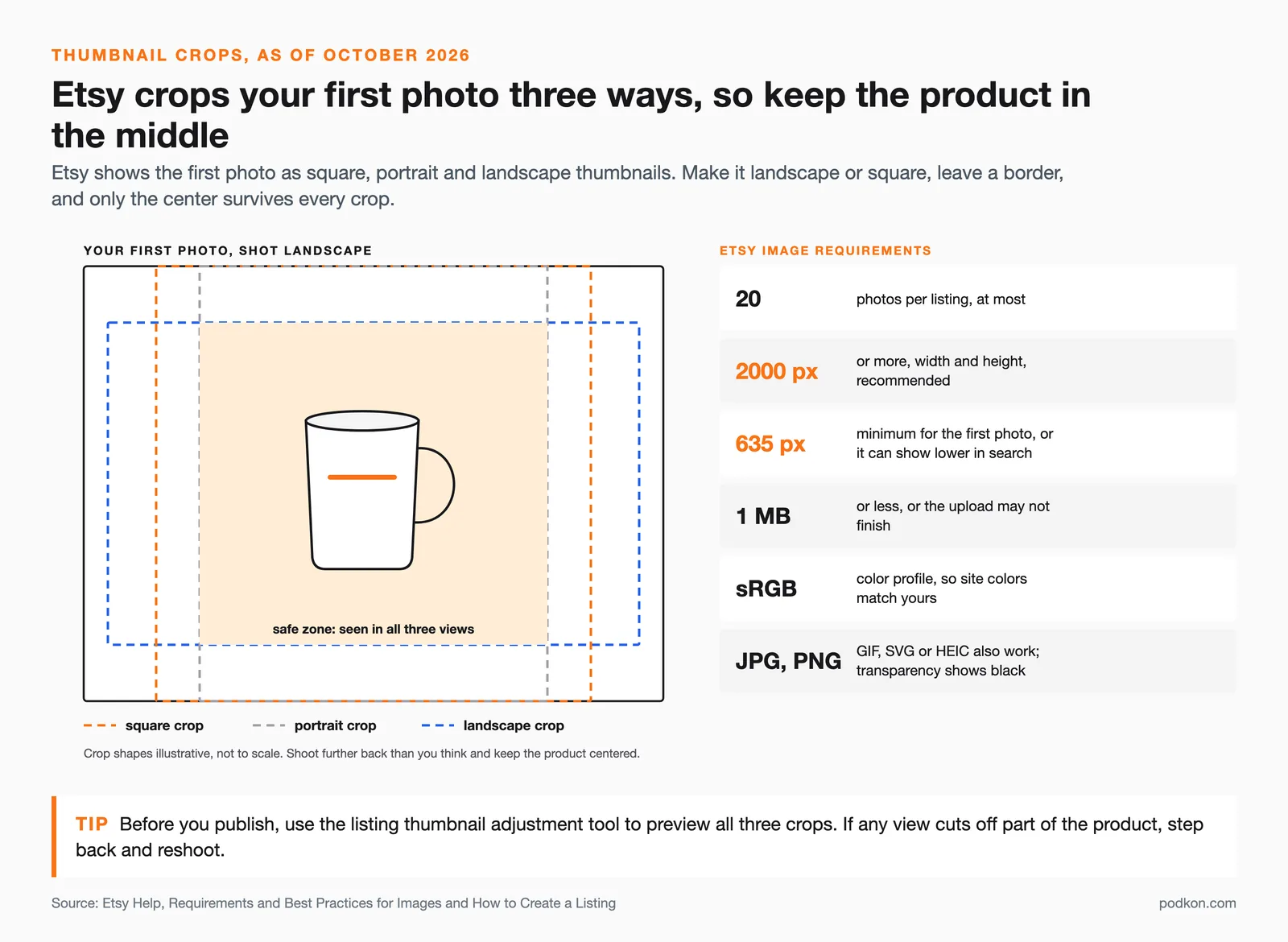
Treat the thumbnail like an ad. Keep it simple, fill the frame with the product, and leave a clean border so Etsy’s square crop does not cut anything important. Many top shops add a small lifestyle cue or a tasteful text label to the first image to stand out in a crowded grid. The only way to know what works for your niche is to test, since the winning style differs by category.
💡 Seller Tip
Run a two-week thumbnail test. Swap your hero image for an alternate, leave the title and tags alone, then compare the click rate in your Shop Stats. Whichever version pulls more clicks earns better placement on its own, because clicks feed Etsy’s engagement signal directly.
How good photos lift conversion and click-through
Photos work on two stages at once. In the search grid, a sharp, clear thumbnail raises your click-through rate, which pulls more visits from the same ranking. On the listing page, a complete set of images that answers size, texture, and use raises your conversion rate, which turns more of those visits into orders. Both signals feed back into how Etsy ranks you, so better photos compound over time.
To get the most from this, point your photo effort at products buyers actually want right now. Shooting a beautiful set for an item with no demand wins nothing. Pair your photography with live demand data so you invest your time where it pays off, then back it with solid listings and pricing. Our walkthroughs on how to sell on Etsy and the best Etsy seller tools cover the rest of the listing engine that turns clicks into sales, and a strong marketing plan drives traffic to photos that are ready to convert.
See what’s selling on Etsy right now
Great photos only pay off on products people are buying. Podkon tracks live Etsy best-sellers and trends across every category, so you can spot demand before you shoot and aim your camera at items with real buyers behind them.
✅ Key Takeaways
- Shoot in soft window light with a clean neutral background and a phone, no studio needed.
- Keep images at least 2000 pixels wide and tall, as Etsy recommends, and never under 635 pixels for the first photo.
- Fill at least 10 of the 20 slots: hero, in use, scale, detail, angles, variations, personalization, packaging, specs, and trust.
- Edit for accuracy and export in sRGB, since over-saturated photos drive returns and bad reviews.
- Treat the thumbnail as an ad and A/B test it, because clicks feed your search placement.
- Aim your photo effort at products with live demand so the work converts.